Capacity bars in properties dialogs
Hi all,
I have been hacking on the ideas I got from people on the previous post + mailing lists. I am pretty happy with the results I have got so far:
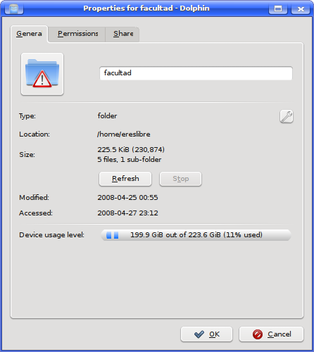
This is how my properties dialog looks showing the actual device usage level:
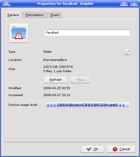
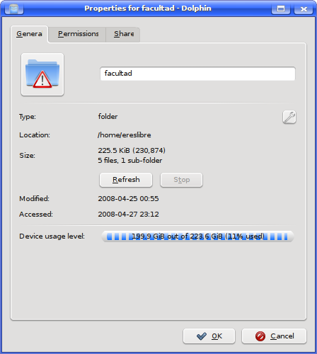
Since I have a pretty small amount of hard disk used, I have taken some shots with the percent hardcoded at 95%. I only have one problem at the moment: I need to think (ideas are welcome) how text can be drawn to correctly be seen even when the capacity bar is below the text:
The first screenshot shows the capacity bar with “fill full blocks” enabled, while on the second it is disabled. When disabled, this property would let the last block to have a different width than the rest if the percent is a certain one.
Apart from improving the general appearance of the capacity bar, I think it would be great to make each block that goes to a higher percent more red. Maybe starting on green, and going through yellow. I will play with that tomorrow, I guess 🙂
Comments ? Ideas ? Suggestions ?