Drag pixmap hacking
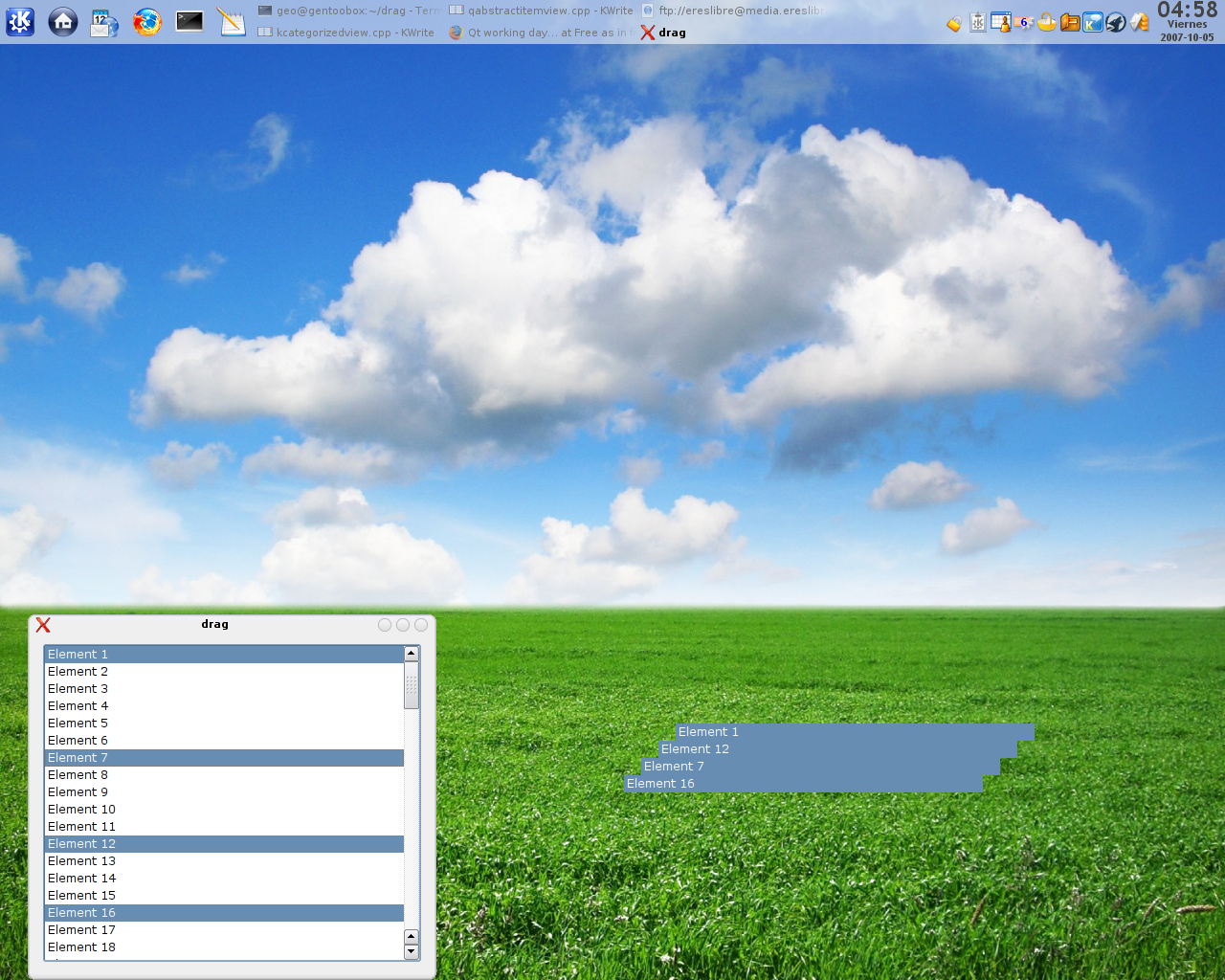
On a quick hack I wanted to change the way things are shown when dragging items from an itemview. Stephen on the last post suggested that doing what we currently do can be improved. I agree with him, and despite I know that this solution is not the best, I still think is slightly better than the current one.
The screenshot in question is here:
You can apply the patch here to test the behavior. Right now, with Dolphin (that uses KFileItemDelegate) I get strange drawing. Probably is because of some changes done to it lastly… but I’m right now very tired to track it… At least, the code I’ve written (the patch you see there) should be right, and this small test case in theory proves it… 🙂
From this screenshot you can imagine the layout of the selected items. I know that there are clever ways of doing so… but this one could work very nicely and without so many screen loss. What do you think ? Have you got an ideal layout ? Mockup please !
