Final approach ?
On the very previous post I was suggested to create a dot story and poll there people with this question. Well, I don’t know if this could be a “dot story” 🙂
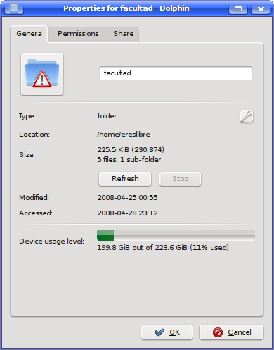
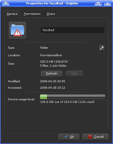
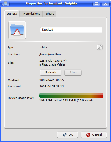
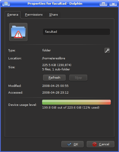
I guess this time I got to a final approach (on what the “continuous bar” is concerned). I added another gradient (vertical) so it doesn’t look so 90’s. I used KColorScheme and QPalette to correctly use colors, and it seems I get good results with all the color schemes I have on KDE 4.
Maybe a border to clearly mark where the widget starts and where ends.
Nuno Pinheiro had given me some input on how to draw a nicer approach. This is the one I like most 🙂 He told me to use a solid color for the capability bar itself, but after trying the green-to-red gradient I just couldn’t resist to it.


The widget design is based (really, fast based) on the mockup Nuno did tonight for me :). Thank you very much Nuno. I really like the shape this widget is taking. 🙂