KCategorizedView – a polite approach
So many time without blogging… For being honest I have been really busy with university (still hell busy), and I have had time for coding mostly, without blogging on recent work I have been doing. Anyway, the short story, didn’t find the time to blog.
At this point, I am really happy to show you the new shiny KCategorizedView. It is not still on KDE’s SVN, but it will soon hit it. This new implementation will make it for 4.3, and is the implementation I was dreaming about.
When I was rewriting it from scratch, I could read Celeste’s post, and wrote it down deep in my mind. This was all about KCategorizedView and I had to fix all those problems now that I was on it.
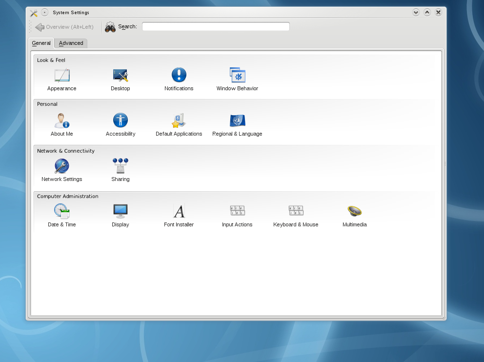
That’s the time I asked Nuno to design a mockup (talking with Celeste also, to have the usability team approval). He sent me this two mockups:
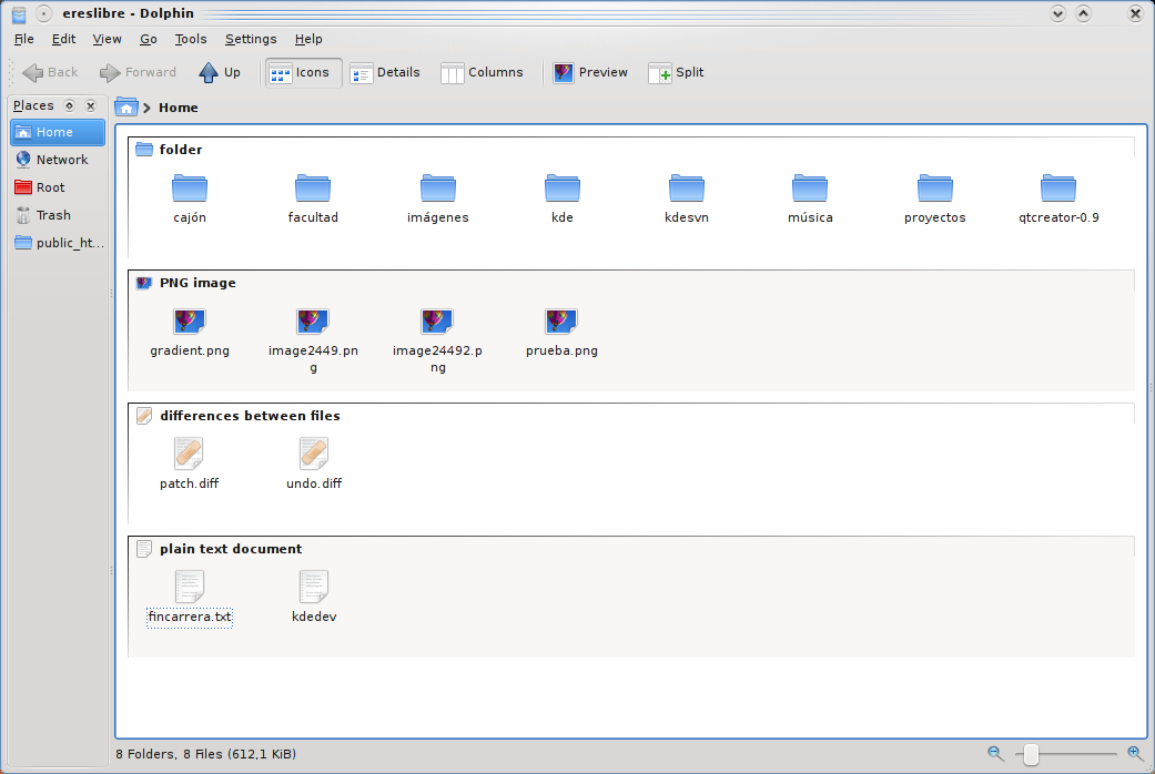
This one is meant for systemsettings, while the next one is meant for Dolphin:
Until now, the “category drawer” was the header of the category. This means, it could say: my height is 15 pixels. The view would ask it to be drawn on a rect of height 15 at the beginning of the category. I understood at this point that this wasn’t enough. So, after looking at both screenshots I understood the category drawer should be able to draw everywhere on that category bounds (imagine if you want to draw a big folder on the bottom right part of the category ‘folders’ when sorting by type). Nowadays, on the new implementation, the category says: my height is 15 pixels. Then the view can do some operations to know the size of the whole block (say, 100 pixels height), and then when the category is asked to be drawn, it gets a 115 pixels height rect where it can draw. Of course is its own decision to only draw on the first 15 pixels if it wants so.
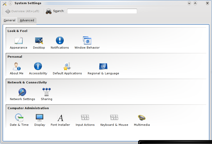
After so many talking, on a first approach of drawing and trying to get those mockups right, I have something like this:
Note that the alternate block coloring is not on the mockup, and probably will be removed, it was just for testing purposes.
Note also that this is not even on KDE subversion repository, and even when it gets to it, the way things are drawn can radically change if someone has objections and they are well based.
Please also note that screenshots are not very close to mockups in certain places. Just be patient, they will =)
I really love to see this on KDE SVN soon, since internally it got amazingly polite from my POV, what makes it really easier to maintain than the older view, and also to contain no hacks internally, what is very important.
If you feel like it, you can find all the work I am doing separately here for kdelibs, and here for kdebase.


